PROJECT 01 ・ 2025年7月
Pickleholic
Booking and brand site for Pickleholic, a premium indoor pickleball venue in Melbourne. The showcase now foregrounds the visual system behind the live experience: court-green trust cues, high-energy yellow CTAs, image-led modules, and rounded interaction patterns that carry users from curiosity to booking.
TL;DR
Brief
A new premium pickleball venue needed a booking site that could convert rookies through seasoned pros into bookings and memberships.
What I did
Owned end-to-end UI/UX — information architecture, content structure, high-fidelity design, and the supporting visual system.
Outcome
Shipped on schedule for the venue's opening. Now the primary surface for court bookings, memberships, and event registrations.
01 · BACKGROUND
A new home for Melbourne pickleball.
Pickleholic is a new pickleball facility in Clayton, Victoria, with seven professional-grade indoor courts. Pickleball is the fastest-growing racket sport in Australia, and the venue invested heavily in pro-tier infrastructure — Dominator nets, 6.5m ceilings, evenly distributed lighting, and 9ft pro-series pool tables.
Premium positioning only works if it's communicated clearly. The site had to do that work.
02 · PROBLEM
Four audiences, one homepage.
A wide audience — rookies, weekend social players, intermediates, and competitive doubles teams — all needed to land on the same homepage and immediately find their next step.
Some wanted to book a court for casual play. Others wanted to sign up for a DUPR-rated tournament, join a coached clinic, or commit to a membership. A separate booking platform handled the actual transactions, so the marketing site had to hand off without breaking flow or trust.
Visitors had to feel both welcomed (rookies) and taken seriously (seasoned players) within five seconds of landing.
03 · PROCESS
Discover, define, design, deliver.
01
Discover
Audited competitor pickleball and racquet-club sites in AU and the US, plus the technical constraints of the Playbypoint booking platform.
02
Define
Mapped four primary user intents — book, join, compete, learn — and aligned them with landing-page sections.
03
Design
Built a visual system around bold display type, photography-led feature blocks, and high-contrast CTAs.
04
Deliver
Worked alongside engineering to hand off Astro components, asset crops, and motion specs for marquee elements.
04 · VISUAL SYSTEM
A brand system that feels like a court in motion.
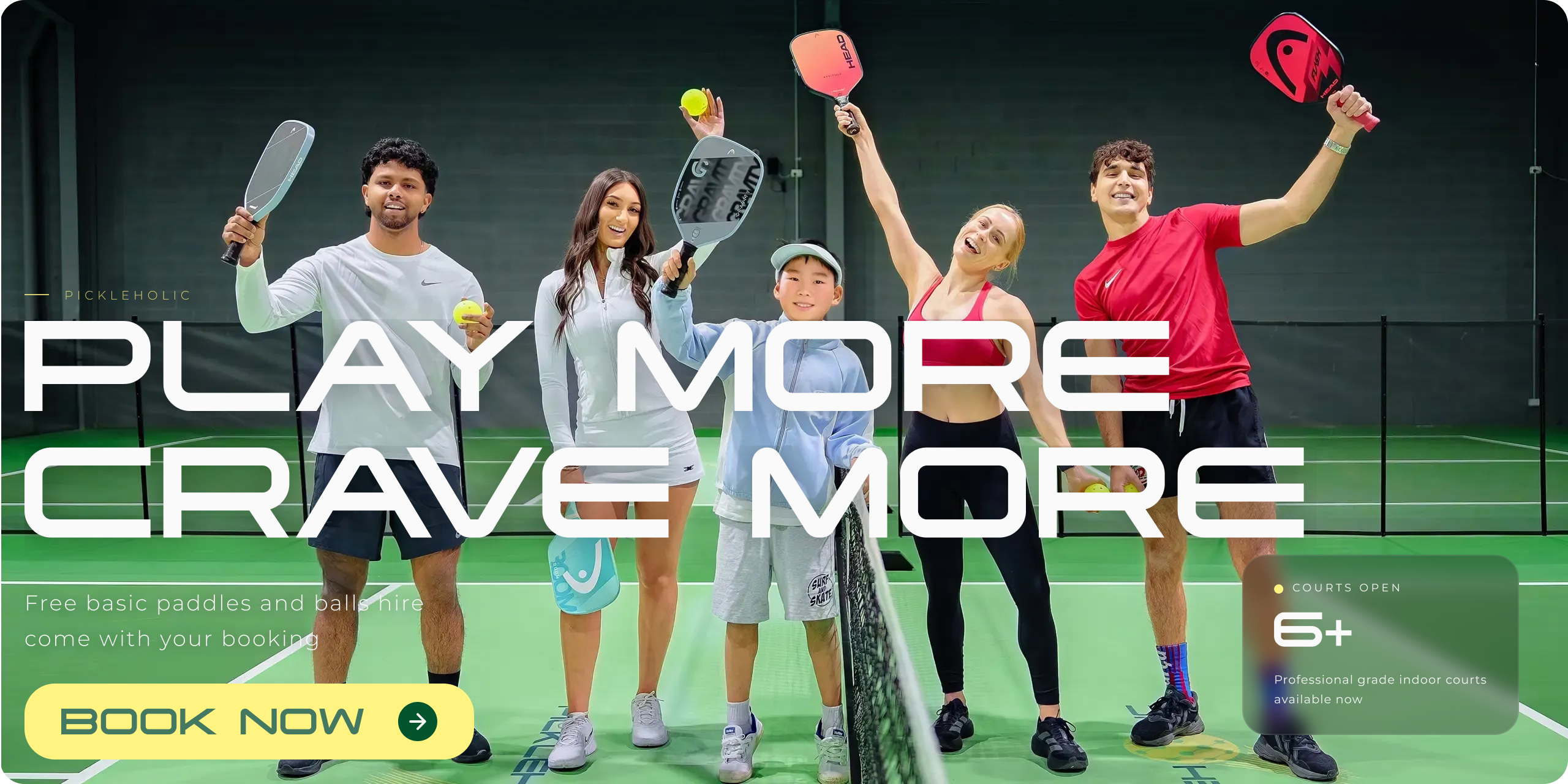
The live site at www.pickleholic.com.au is not just a booking funnel. It uses court-green surfaces, energetic yellow CTAs, rounded modules, large image crops, and motion-led type to make the venue feel premium, active, and immediately bookable.
Green does the trust work. Yellow does the action work.
Primary
#457860
Court
#91B792
CTA
#FFF382
Gray
#828282
Surface
#F7F7F7
The palette mirrors the physical venue: court green for credibility and indoor-sport context, fluorescent yellow for booking energy, and quiet neutrals so photography stays dominant.
TYPOGRAPHY
A sporty display voice, supported by functional sans.
Tachyon display
PLAY MORE
CRAVE MORE
Used for the hero and marquee language. Condensed, technical, and high-energy, so the brand feels fast without adding visual clutter.
Montserrat UI
BOOK NOW · MEMBERSHIPS
Used for CTAs, navigation, tabs, and labels. Its geometric rhythm makes the booking path feel direct and familiar.
Noto Sans backup
Beginner clinics · DUPR divisions · social play
Keeps dense event and program details readable, especially where the site shifts from brand moment into decision-making.
THEME
Premium, but still playful.
No-frills confidence
Black/green type, direct navigation, and obvious booking paths keep the experience practical.
Social energy
Marquees, rounded pills, and bright CTAs make the venue feel active before the user reads a paragraph.
Rookie-to-pro range
Simple labels and tabbed choices let new players self-select without making competitive players feel underserved.
UI MOTIFS
Patterns that repeat across the product.
Rounded controls, tab highlights, green overlays, and image-first modules become the connective tissue between marketing, events, and booking handoff.
LIVE SITE EVIDENCE
www.pickleholic.com.au uses the palette and type system consistently across hero, About, Features, Events, Social Play, Clinics, and booking CTAs.
DINK.
DINK.
DINK.
DINK.
DINK.
DINK.
DINK.
SMASH.
SMASH.
SMASH.
SMASH.
SMASH.
SMASH.
SMASH.
REPEAT.
REPEAT.
REPEAT.
REPEAT.
REPEAT.
REPEAT.
REPEAT.
05 · OUTCOME
Shipped on schedule.
Launched in July 2025 for the venue's opening week. The site became the venue's primary surface for all bookings, memberships, and event registrations, with a clean handoff to book.pickleholic.com.au for transactions.
1
Brand identity spanning
site and physical courts
2 mo
From kickoff to
launch-ready handoff
06 · REFLECTION
What I'd push further.
Worked well. Tight collaboration with the venue owners on copy and brand voice meant the marquee moments (DINK. SMASH. REPEAT.) give the site personality without diluting bookability.
Would do differently. I'd push for a stronger first-booking onboarding flow — the handoff to Playbypoint still requires extra context for newcomers booking their first session. A short interstitial explaining what to expect at the venue would close that gap.