PROJECT 03 · 2024–2025
PROJECT 03 ・ 2024–2025年
Bihada Navi
美肌ナビ
Mobile skincare app designed from planning for the Japanese market — bringing 16-type skin diagnosis, personalized recommendations, in-app commerce, point rewards, and campaign mechanics into a single coherent product across iOS and Android.
日本市場向けに企画段階からデザインしたスキンケアアプリ。16タイプの肌診断・パーソナライズされたレコメンド・アプリ内EC・ポイント機能・キャンペーン機能を、iOSとAndroid両対応のひとつの一貫したプロダクトとして設計しました。
'/%3e%3cdefs%3e%3cradialGradient%20id='paint0_radial_0_246'%20cx='0'%20cy='0'%20r='1'%20gradientUnits='userSpaceOnUse'%20gradientTransform='translate(110%20110)%20scale(110)'%3e%3cstop%20stop-color='%23B8C5A2'/%3e%3cstop%20offset='1'%20stop-color='%23B8C5A2'%20stop-opacity='0'/%3e%3c/radialGradient%3e%3c/defs%3e%3c/svg%3e)
'/%3e%3cdefs%3e%3cradialGradient%20id='paint0_radial_0_239'%20cx='0'%20cy='0'%20r='1'%20gradientUnits='userSpaceOnUse'%20gradientTransform='translate(180%20180)%20scale(180)'%3e%3cstop%20stop-color='%237E8C6B'/%3e%3cstop%20offset='1'%20stop-color='%237E8C6B'%20stop-opacity='0'/%3e%3c/radialGradient%3e%3c/defs%3e%3c/svg%3e)
// 03 — a skincare app, end to end
// 03 — スキンケアアプリを、端から端まで
Five flows. One product.
5つのフロー。1つのプロダクト。
A consumer skincare app for Japanese users — diagnosis, recommendation, commerce, rewards, and campaigns designed to feel like one coherent product rather than five features stitched together. Shipped to iOS and Android.
日本のユーザー向けコンシューマースキンケアアプリ。肌診断・コスメおすすめ・EC・ポイント・キャンペーンそれぞれが独立した機能ではなく、ひとつの一体感あるプロダクトとして成立するようにデザインしました。iOSとAndroid両対応でリリース済み。
TL;DR
Project
Mobile skincare app for the Japanese market — five flows in one product: 16-type skin diagnosis, personalized recommendations, in-app EC, point rewards, and campaigns. Shipped to iOS and Android.
企画段階からデザインしたスキンケアモバイルアプリ。16タイプの肌診断・パーソナライズされたレコメンド・EC・ポイント・キャンペーン機能をひとつのプロダクトに統合。
My role
Main UI/UX designer from the planning phase through high-fidelity screens, in collaboration with other designers and engineering.
メインUI/UXデザイナーとして、企画から高品質なiOS・Android対応スクリーンの制作まで、他のデザイナーおよびエンジニアリングチームと協働しながらUX全体を担当。
Contribution
Owned the five user flows end-to-end. Built the visual system and component library that kept the app coherent across all of them.
肌診断・EC・ポイント・キャンペーン各フローのユーザーフロー設計、ビジュアルシステムの構築。bihadanavi.comのメディアサイトと並行してiOS・Androidでリリース。
01 · Background
A new app, from the planning phase.
企画段階から始まった、新しいアプリ。
美肌ナビ is a mobile skincare app for the Japanese market, designed to do five things well in one place: diagnose a user's skin type across 16 categories, recommend products matched to their concerns, sell those products in-app, reward returning users with points, and surface time-bound campaign offers.
I joined at the planning stage as the main UI/UX designer — before flows were defined — working alongside collaborating designers to shape the product end-to-end across iOS and Android.
美肌ナビは、日本市場向けのスキンケアモバイルアプリです。16カテゴリにわたる肌タイプ診断・悩みに合った商品レコメンド・アプリ内EC・ポイントによるリピート促進・期間限定キャンペーン提示——この5つをひとつの場所でうまく機能させることを目指しました。
私はメインUI/UXデザイナーとしてフロー設計が固まる前の企画段階から参加し、他のデザイナーと協力しながら、iOSとAndroid両対応でプロダクト全体のデザインを主導しました。
02 · Challenge
Five flows, one product.
5つのフロー、1つのプロダクト。
The app had to bring five distinct flows into a single coherent experience — each with its own pacing, vocabulary, and emotional register — without feeling like a stitched-together toolbox.
このアプリは、それぞれ異なるテンポ・言語・感情的なトーンを持つ5つの独立したフローを、ひとつの一体感あるUXにまとめる必要がありました——ただ寄せ集めたツールボックスにならないように。
Skin diagnosis. A multi-step intake that decides the user's skin type. Pacing and trust mattered more than speed; this flow couldn't feel like a quiz.
Personalized recommendation. Diagnosis output turned into curated products. The handoff from "you are this type" to "here is what's for you" is the product's emotional pivot.
EC — browse, cart, checkout. Native-feeling commerce: product detail, cart, address, payment. The conversion path without the conversion shouting.
Points & rewards. Login, review, and purchase loops with balance, history, and clear paths to earn more.
Campaigns. Time-bound promotions that needed their own entry and progression without disrupting everyday navigation.
・肌診断。ユーザーの肌タイプを決定する多段階の入力フロー。スピードよりも、信頼感とテンポ感が重要で、クイズのような印象を与えてはいけない。
・パーソナライズされたレコメンド。診断結果をキュレートされた商品に変換するステップ。「あなたはこのタイプ」から「あなたへのおすすめはこれ」への移行がプロダクトの感情的な軸になる。
・EC - ブラウズ・カート・チェックアウト。ネイティブな操作感のEC体験:商品詳細・カート・住所・決済。購入体験をアプリの静かなトーンに溶け込ませる。
・ポイント・リワード。ログイン・レビュー・購入によるポイント獲得フロー。残高・履歴・獲得方法の見せ方。
・キャンペーン。期間限定のキャンペーン体験。エントリーから進行・リワード表示まで、通常のナビゲーションを妨げない形での設計が必要。
The design challenge was holding all five together so the app reads as one product, with a single component vocabulary and a single visual rhythm.
これら5つをひとつのプロダクトとして読める——共通のコンポーネント語彙、一貫したビジュアルリズムで統一することがデザイン上の核心的な課題でした。
03 · Process
From plan to platform parity.
企画からプラットフォーム対応まで。
The work happened in collaboration with other designers and product, with me leading UI/UX.
他のデザイナーおよびプロダクトチームとの協働のもと、UI/UXリードとして以下のプロセスで進めました。
01
Plan.
Mapped the product against user intents (diagnose · learn · find · buy · come back). Aligned with product on which intents the app would prioritize at launch and which would expand later.
企画
ユーザーのインテント(診断する・知る・見つける・買う・また来る)に対してプロダクトをマッピング。リリース時に優先する機能と将来的に拡張する機能について、プロダクトチームと認識を合わせました。
02
Define.
Built user flows for each pillar — skin diagnosis, EC, points, campaigns — and worked with collaborating designers to keep flow logic consistent across them. Established the information architecture for home, product, profile, and rewards.
定義
肌診断・EC・ポイント・キャンペーンそれぞれのユーザーフローを構築し、協働デザイナーとフローロジックの一貫性を保ちました。ホーム・商品・プロフィール・リワード画面の情報設計を担当。
03
Design.
Produced high-fidelity screens in Figma. Built reusable components for cards, list items, forms, modals, and the EC primitives (price, badge, stock, CTA). Treated the diagnosis flow as a sub-experience with its own visual rhythm so it could carry trust through emotionally loaded questions.
デザイン
Figmaで画面を制作。カード・リストアイテム・フォーム・モーダル・EC基本要素(価格・バッジ・在庫・CTA)の再利用可能なコンポーネントを構築。診断フローは、感情的に重要な設問を信頼感を持って誘導できるよう、独自のビジュアルリズムを持つサブ体験として設計しました。
04
Iterate & hand off.
Reviewed with stakeholders and engineering. Refined for iOS and Android, ensuring touch targets, type, and motion respected platform expectations. Maintained the design system in Figma so additions stayed coherent.
反復とハンドオフ
ステークホルダー・エンジニアリングとレビューを重ね改善。iOSとAndroidのタッチターゲット・テキスト・モーションがプラットフォームの慣習に沿うよう調整。Figma上のデザインシステムを継続的にメンテナンスし、追加機能の一貫性を担保しました。
04 · Features
Seven feature areas.
7つの機能領域。
Skin diagnosis
肌診断
肌診断
Multi-step intake mapping user answers to one of 16 skin types. Framed as a calm, guided experience rather than a quiz.
ユーザーの回答を16タイプのいずれかにマッピングする多段階入力フロー。クイズではなく、落ち着いた誘導体験として設計。
Personalized recommendation
パーソナライズ提案
パーソナライズ提案
Diagnosis output paired with curated products and skincare guidance, surfaced on the home and dedicated recommendation surfaces.
診断結果とキュレートされた商品・スキンケアガイダンスを紐づけ、ホームおよび専用レコメンド画面に表示。
EC — browse · cart · checkout
ショッピング
ショッピング
Product discovery, product detail, cart, and a checkout / payment flow designed to feel native to the rest of the app.
商品発見・商品詳細・カート・チェックアウト/決済フロー。アプリ全体のトーンに自然に溶け込むネイティブなEC体験。
Next-gate campaign
キャンペーン
キャンペーン
A campaign mechanic with its own entry, progression, and reward presentation.
独自のエントリー・進行・リワード表示を持つキャンペーン機能。
Points & rewards
ポイント
ポイント
Point accrual surfaces for login, reviews, and purchases. Balance, history, and how-to-earn explanations.
ログイン・レビュー・購入によるポイント獲得。残高・履歴・獲得方法のUI。
In-app advertisement
広告
広告
Native ad placements that respect the editorial aesthetic without breaking trust.
エディトリアルなデザインの美観を保ちながら、信頼性を損なわないネイティブ広告配置。
Discovery & guidance UI
商品発見
商品発見
Browsing by skin concern, skin type, and item category — mirroring the media site's information architecture inside the app.
肌の悩み・肌タイプ・アイテムカテゴリによるブラウズ、メディアサイトの情報設計をアプリ内で再現。
05 · Screens
Six surfaces, one product.
6つの画面、1つのプロダクト。
Yellow green
#F7FBEA
Mint
#DDE7D2
Sage
#B8C5A2
Forest
#3F4D34
Logo
A green-led palette — cream and mint hold most of the surface; sage and moss carry the brand voice; forest is the deep accent for CTAs and reserved highlights.
グリーンを基調としたパレット——クリームとミントが画面の大部分を占め、セージとモスがブランドの個性を表現し、フォレストはCTAや重要なアクセントカラーとして使用。
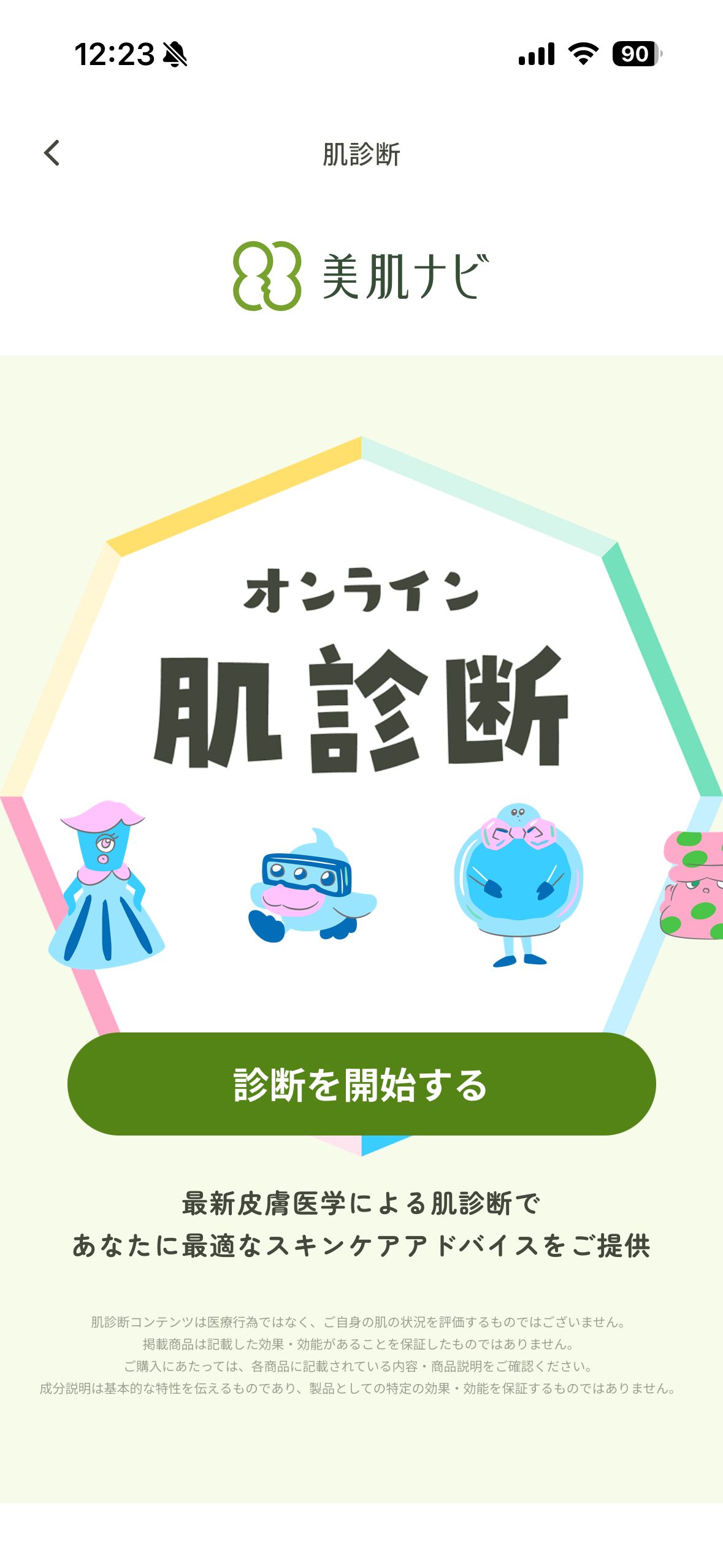
Diagnosis — question step. One question per screen with quiet progress. The flow pacing matters more than the visuals.
診断 - 質問ステップ。 1画面1質問、控えめな進行表示。ビジュアルよりもフローのテンポが肝心。
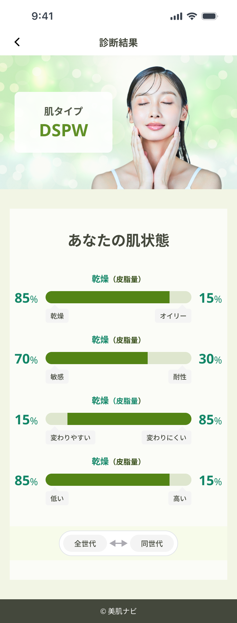
Diagnosis result. Skin type + paired recommendation. The handoff from "tell me about you" to "here's what's for you" is the product's emotional pivot.
診断結果。 肌タイプ+レコメンド表示。「あなたについて教えて」から「あなたへのおすすめ」への移行が、プロダクトの感情的な軸。
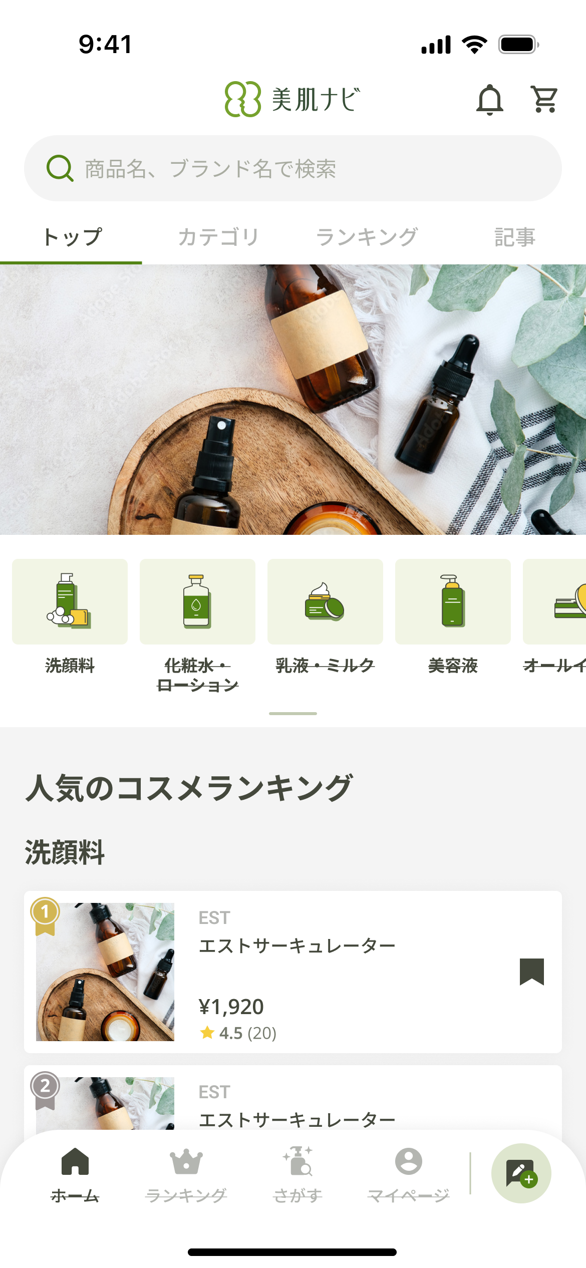
Home / dashboard . Personalized entry — diagnosis result, recommendations, today's editorial, current campaign, point balance. Composed of cards so any module can be re-prioritized.
ホーム / ダッシュボード。 診断結果・レコメンド・今日のコラム・キャンペーン・ポイント残高をパーソナライズして表示。カード構成により各モジュールの優先順位を柔軟に変更可能。
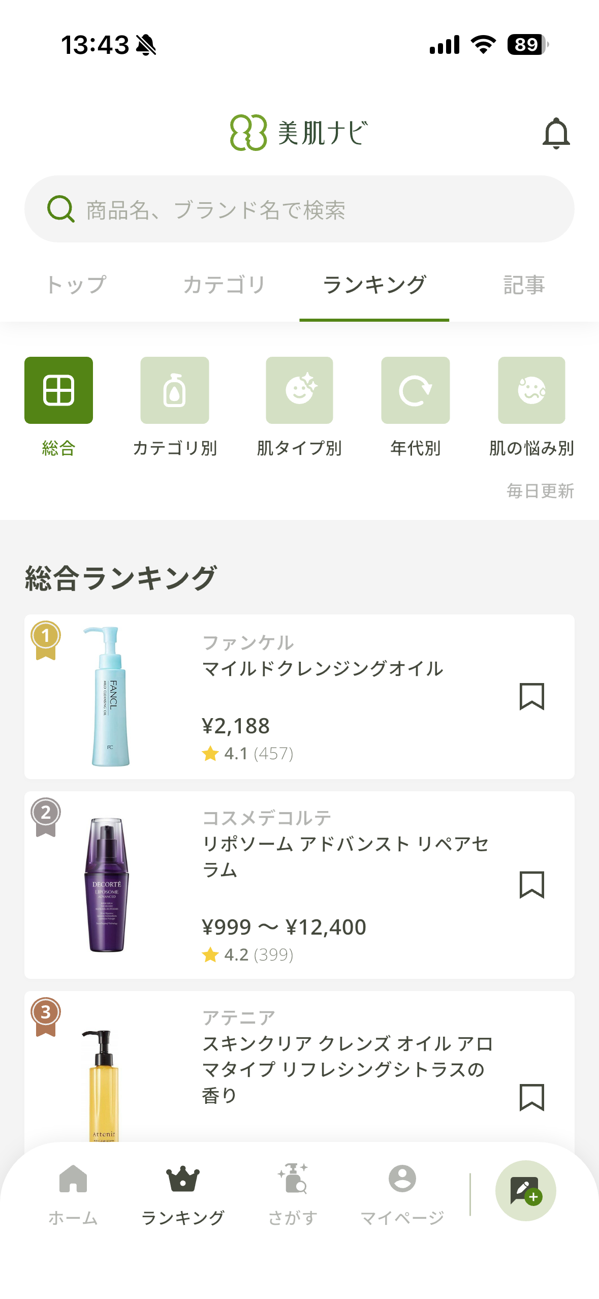
Product list. Filterable browse by skin type, concern, item category. Compact rows keep the editorial calm intact even with many items.
商品リスト。 肌タイプ・悩み・アイテムカテゴリで絞り込み可能なブラウズ画面。コンパクトな行レイアウトで、多数アイテムがあってもエディトリアルな落ち着き感を維持。
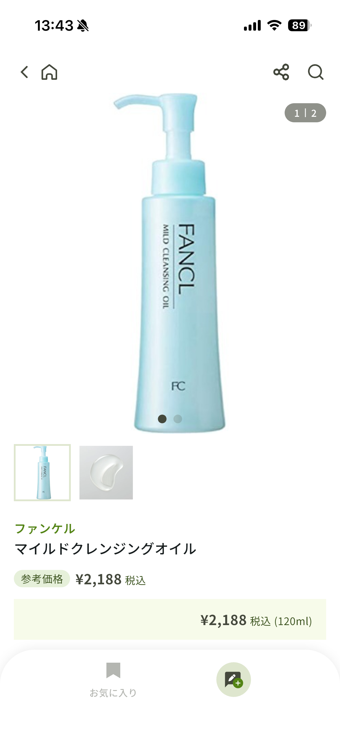
Product detail. Generous image, restrained metadata, single confident CTA. The "shop" feeling without the shouting.
商品詳細。 余白あるビジュアル・抑制されたメタ情報・明快なCTA。ショッピングの圧迫感なく購買を促す設計。
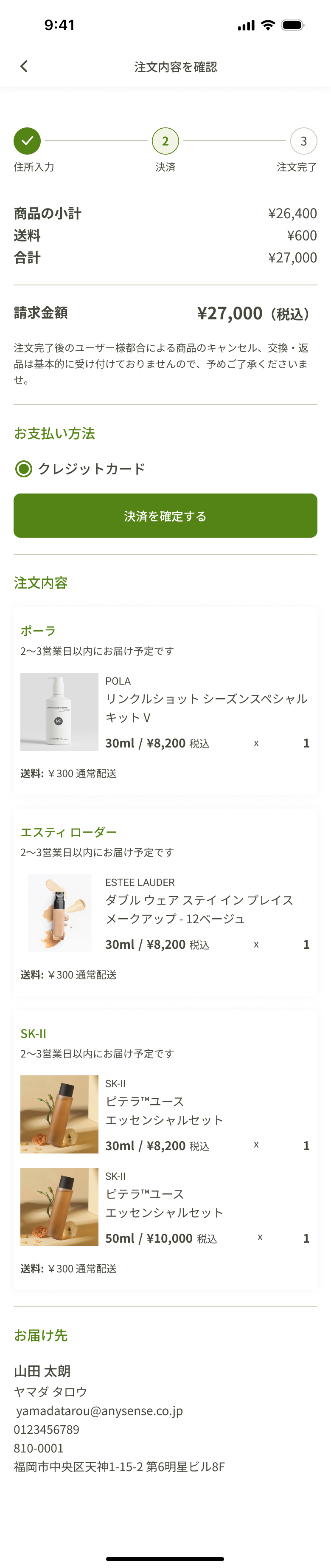
Cart & checkout (next phase). Itemized cart with point preview. Native checkout flow with address and payment on subsequent steps. Conversion built into the product's quiet voice.
カート & チェックアウト(次のフェース)。 明細一覧+ポイント獲得予告。住所・決済は後続ステップで完結するネイティブな購入フロー。アプリの静かなトーンに合わせたコンバージョン設計。
06 · Contribution
What I owned.
担当した領域
Flow ownership.
EC flow, diagnosis flow, campaign flow, and the points loops — each from initial mapping through high-fidelity screens.
UXフロー
ECフロー・診断フロー・キャンペーンフロー・ポイントループを、初期マッピングからHi-Fiスクリーンまで一貫して担当。
Visual system.
Type scale, color tokens, component library, and pattern conventions consistent across diagnosis, EC, and editorial surfaces.
ビジュアル
タイプスケール・カラートークン・コンポーネントライブラリ・パターン規約を定義し、診断・EC・エディトリアル各画面で一貫したシステムを維持。
Cross-designer alignment.
Reviewed and reconciled design output with collaborating designers so the app stayed cohesive across feature areas owned by different hands.
デザイナー間の一貫性確保。
協働デザイナーとデザインアウトプットをレビュー・調整し、複数人が担当した機能領域をまたいでアプリの一体感を維持。
07 · Reflection
What stayed with me.
このプロジェクトで得たこと。
Coherence is a component problem.
Five flows could have felt like five apps. Shared cards, shared CTAs, shared pill conventions, shared type pairing — every component we agreed on at the system level removed one downstream argument about whether something belonged in the product.
一体感はコンポーネントの問題。
5つのフローが5つの別アプリに見えかねない中、共通のカード・CTA・ピル・タイポグラフィペアリングを統一することで、システムレベルで合意したコンポーネントひとつひとつが「これはこのプロダクトのものか?」という後の議論を一つずつ消してくれました。
Cross-platform parity is a discipline, not a deliverable.
iOS and Android each have native expectations for touch targets, navigation patterns, and motion. Designing both in parallel — rather than designing one and porting — kept the app feeling at home on either platform without diverging the brand voice.
クロスプラットフォーム対応は成果物ではなく、継続的な取り組み。
iOSとAndroidはそれぞれタッチターゲット・ナビゲーションパターン・モーションに固有の期待値があります。片方をデザインして移植するのではなく、並行してデザインすることで、ブランドトーンを保ちながらどちらのプラットフォームでも自然なアプリとして成立させることができました。
A NOTE ON THIS CASE STUDY
Business outcomes and downstream metrics aren't claimed on this page — only design responsibility and process are documented here. The app is live on the App Store.
このページではビジネス上の成果や数値的な指標は記載せず、デザイン上の責任範囲とプロセスのみをドキュメントしています。アプリはApp Storeにて公開中です。