PROJECT 04 ・ 2022年1月
Developer's Portfolio
v1
First portfolio site for Louis Phan — a creative, 3D-led showcase that treats motion as content and the 404 page as design real estate. A deliberate counterpoint to the quieter v2 that came later.


// v1 — the creative cut
The web, but make it move.
v1 is still live at v1.louisphn.com. So is its 404 page — that's not a broken link, it's a side room of the portfolio. v1 and v2 aren't predecessor and successor. They're two answers to two different questions: what can you build, and what have you built.
TL;DR
Brief
A self-taught engineer wanted a first portfolio that proved he could build memorable interactive experiences — not just describe them.
What I did
Designed a creative, 3D-led site where motion is the content. Specified scroll choreography, color, type, and 404 page craft. Prototyped motion in After Effects before handoff.
Outcome
Still live at v1.louisphn.com. Opened the door to creative-coding work, and now sits alongside the quieter v2 as a deliberate creative counterweight.
01 · BACKGROUND
A creative-coding showcase.
An early collaboration with Louis Phan, a self-taught software engineer focused on the web. He'd been teaching himself by building expressive, interactive things — Three.js scenes, shaders, scroll-driven motion. His first portfolio had to be one of those things, not just list them.
That's the thing that made v1 different from a typical developer portfolio. It wasn't a CV with screenshots. It was a creative showcase whose job was to prove a point: I can make the web feel like this.
02 · BRIEF
A site that feels alive.
"I want a site that feels alive. Loads fast, but doesn't apologize for being expressive. Every page should reward exploration. The 404 page counts too."
The site had to present a handful of projects with enough detail to land interest in ten seconds, showcase Louis's creative-coding range — 3D, motion, interaction — without feeling like a demo reel, and treat every page (including 404, contact, project detail) as design real estate.
03 · PROCESS
Design to the strengths.
Designing for a creative-coding engineer changed the work in a few specific ways.
Motion as content, not decoration.
Every interaction had to say something — about the project, about Louis's craft, about how the site itself was made. Anything that was motion for motion's sake got cut.
Design at the edges, too.
The 404, the contact form, the cursor — the easily-skipped surfaces — got the same treatment as the home page. The whole point of v1 was that there were no boring corners.
Trust the builder.
Louis is a creative engineer. I designed to his strengths (3D, shaders, scroll interactions) instead of designing safely and hoping he'd add flourish later. Most of v1's best moments came from him pushing past what I'd specced.
04 · VISUAL
A simple palette.
v1's palette breaks from 2022's default developer-portfolio monochrome. A gradient sits against deep ink, with a single cyber accent that does most of the visual work — saturating CTAs, highlighting hover states, and tinting the 3D scenes so the whole site reads as one piece.
Cream
#F2EFE6
Ink
#121212
Gradient
Type was treated as a primary design element, not a wrapper for content. A high-contrast display serif anchors each section. Body sans stays out of the way. Mono shows up only for metadata and easter-egg moments — the developer's voice peeking through the design.
Move first, then explain.
A portfolio that opens with a 3D object instead of a paragraph. The motion is the introduction.
// built with three.js, react-three-fiber, and a lot of patience
05 · MOTION
Motion is the introduction.
Most portfolios animate things. v1 was designed so that motion is the content — the way an element moves carries information that a still frame couldn't. Easing curves, durations, and scroll mappings were specified and prototyped before any production code was written.
The 404 has its own motion.
Most 404s are afterthoughts. v1's page-not-found got the same motion budget as the home page — a separate scene, a separate animation cycle, a separate cursor behavior. The joke only lands because the craft is real.
06 · PIPELINE
Designed for handoff, not after it.
Motion design lives or dies in the handoff. v1's pipeline kept the design intent intact from moodboard to production code by using the right tool for each phase, with overlap between phases instead of clean walls between them.
Reference
Moodboard
Visual references from creative-coding sites, music videos, motion graphics reels. Pinned in Figma; revisited at every iteration.
Static design
Figma
Hero, projects, about, 404. All static states. Shared component library, type tokens, color tokens. Annotated with motion notes per element.
Motion prototype
After Effects
Animatics for every scroll-driven sequence. Easing curves explored visually before they hit code. Exported as short MP4s for engineering reference, with key durations and curves listed in a handoff doc.
Production
R3F · GSAP
React Three Fiber for the 3D layer, GSAP ScrollTrigger for the DOM motion layer. Both read the same scroll-progress value so 3D and 2D stay locked together.
After Effects was the linchpin. Trying to spec motion in Figma comments alone leaves too much room for drift between intent and implementation; trying to specify it in code first means the design is hostage to engineering capacity. AE in the middle gave the developer something to watch, paired with explicit easing curves and durations to copy.
07 · SCREENS
Surfaces of v1.
Five surfaces, each with a specific design job.
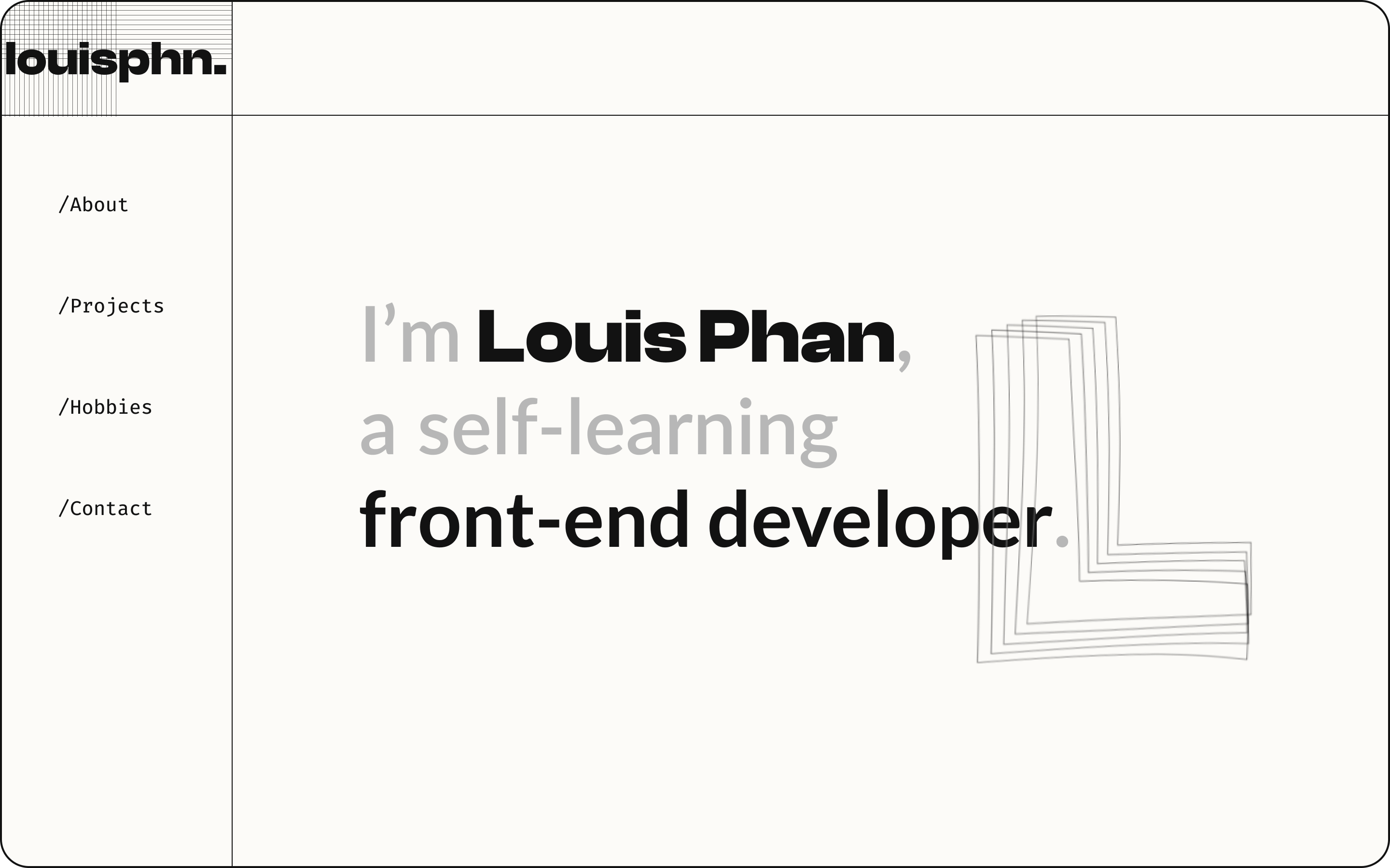
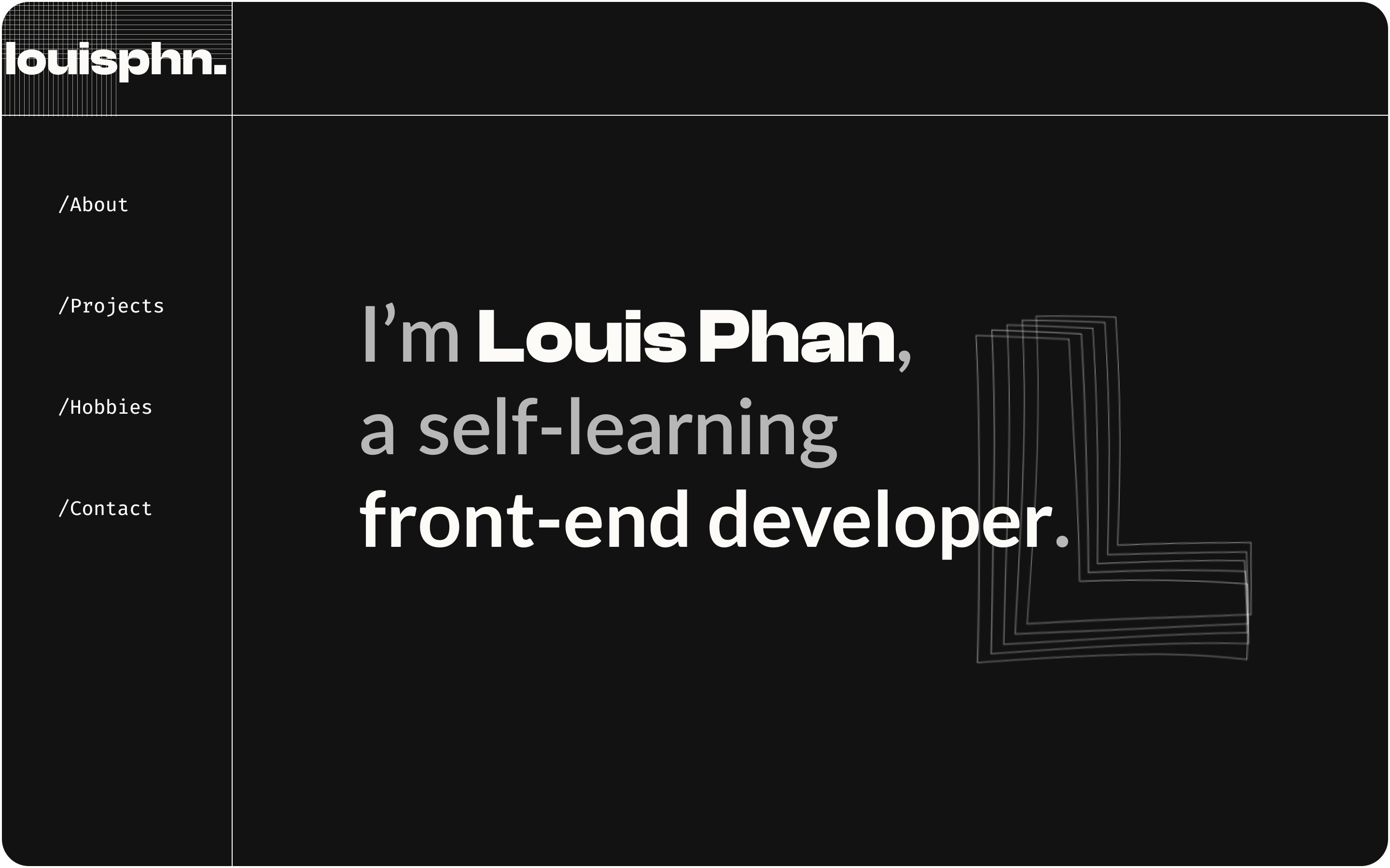
Home — hero. 3D object idles in the center as type fades in around it. The cursor parallaxes a subtle camera offset. No "welcome" copy — the motion is the welcome.
 v1.louisphn.com/feature
 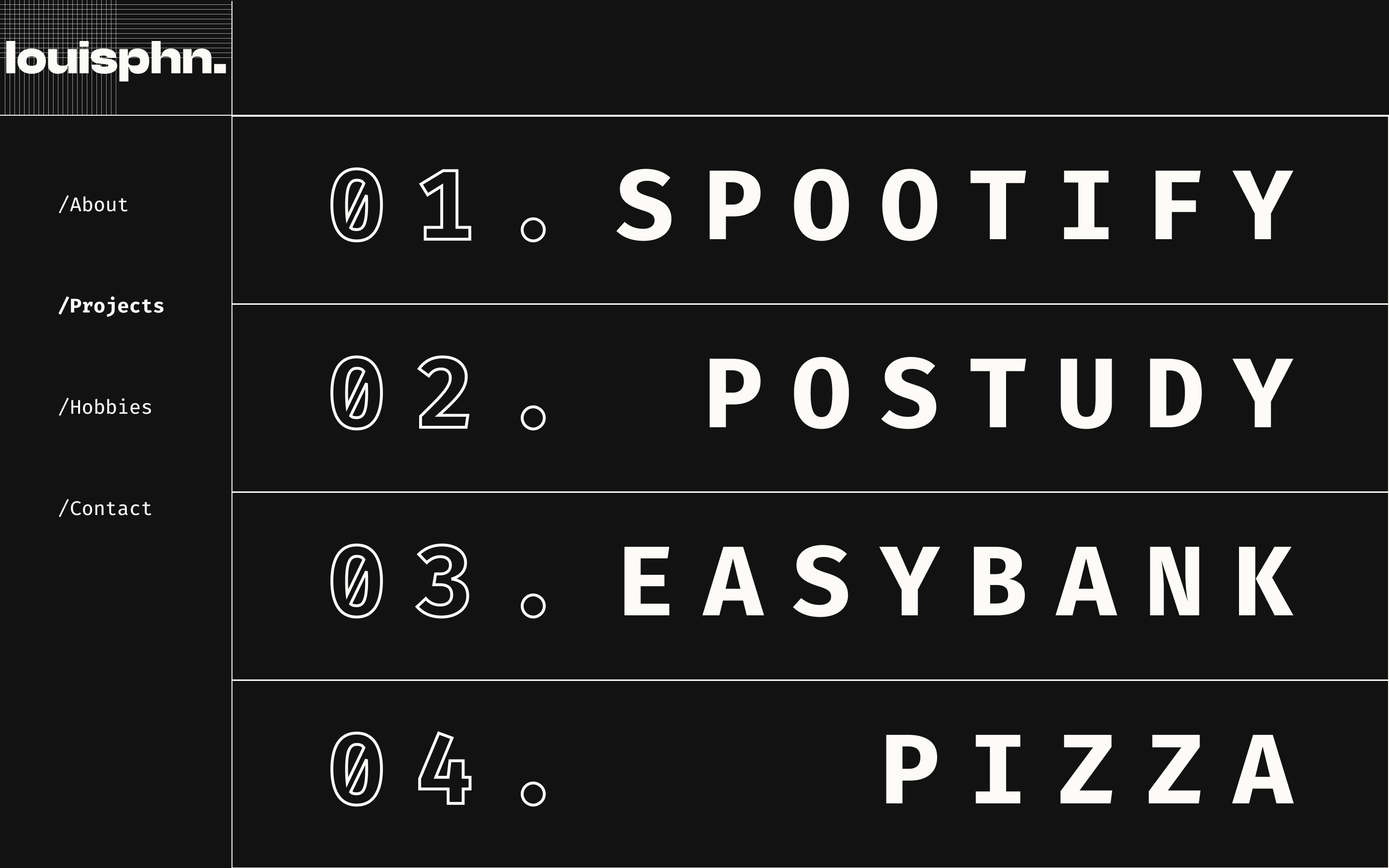 v1.louisphn.com/hobbies
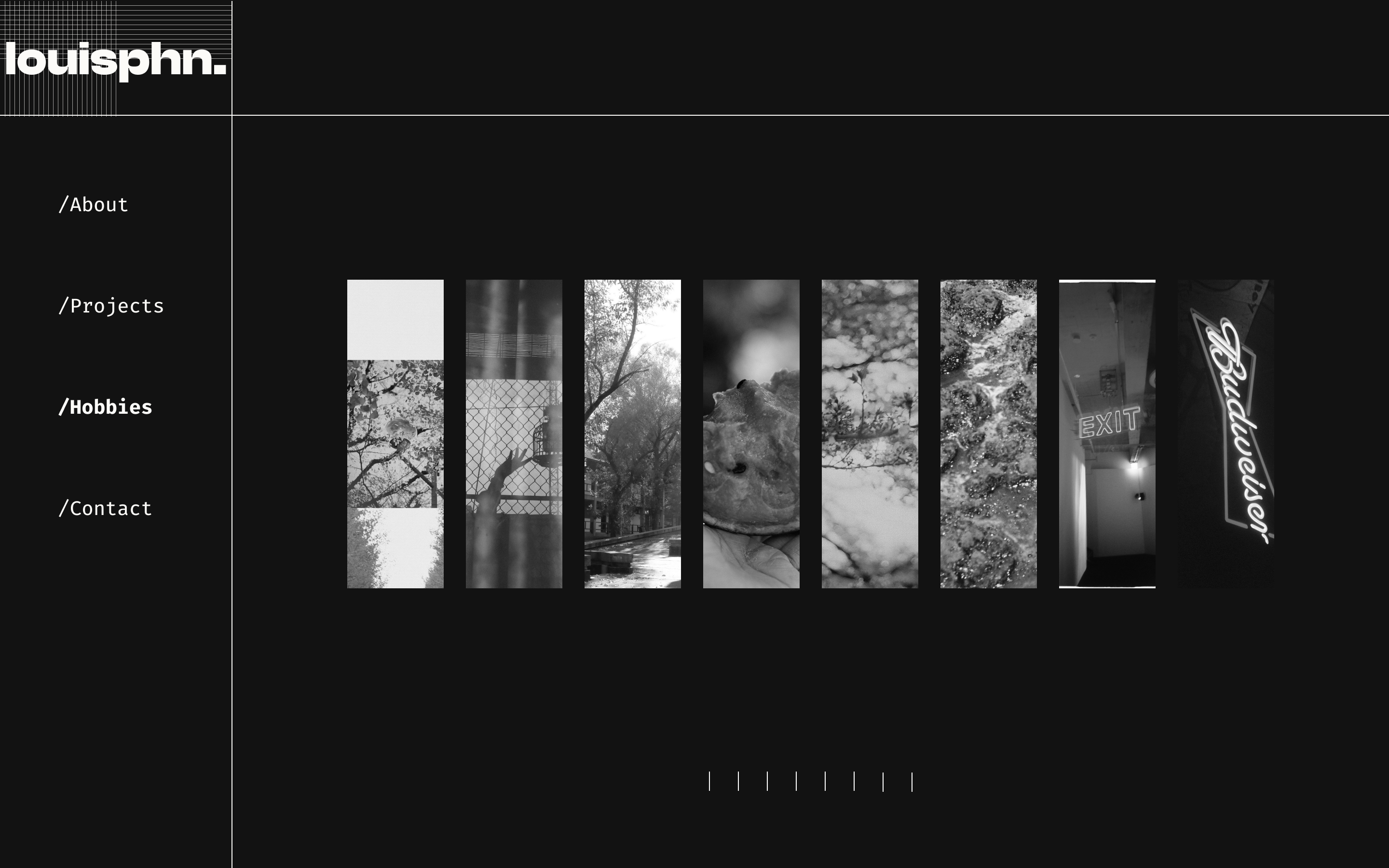
Projects. Each card pins and unfolds as scroll advances. Hover surfaces a project's accent color and a brief role/stack line.
v1.louisphn.com/hobbies 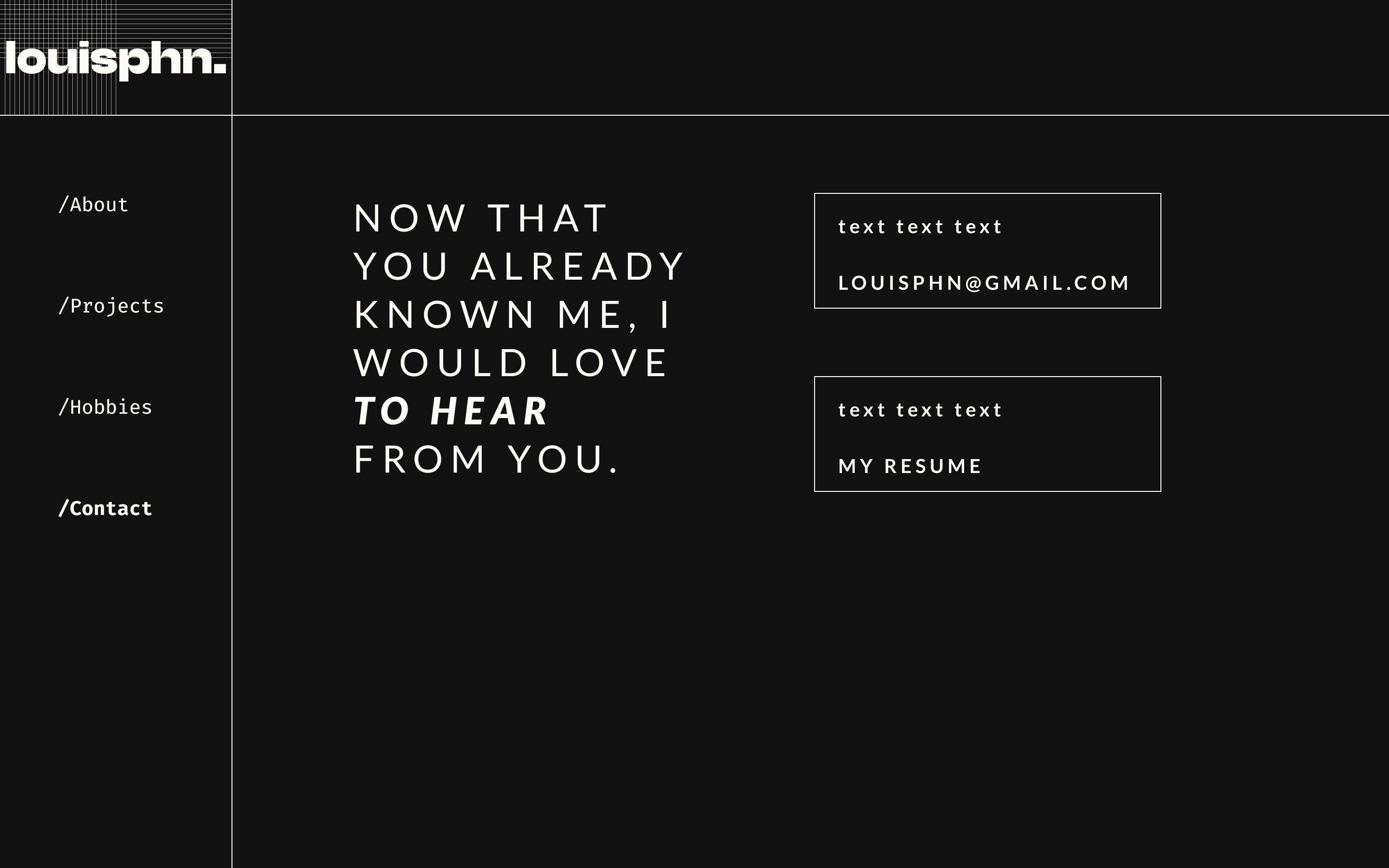
 v1.louisphn.com/page-not-found
 404 page. Designed as a destination, not a dead end. Its own scene, its own animation cycle, its own cursor. The favorite page on the site.
08 · REFLECTION
What stayed with me.
Trust creative collaborators to push.
The strongest moments in v1 are places where Louis took my static designs and added a layer I couldn't have specified — a shader, a cursor behavior, a scroll-coupled animation. The work is better because I didn't try to over-specify it.
A 404 is design real estate.
Every surface a user might land on is a chance to communicate. v1's 404 page taught me that the surfaces nobody plans for are often the ones that get remembered.
v1 and v2 are different products.
Louis later built louisphn.com — a quieter, content-led v2 focused on professional context. They're not predecessor and successor. They're two answers to two different questions: what can you build? (v1) and what have you built? (v2).
A NOTE ON V1 AND V2
v1 is still live at v1.louisphn.com — and so is its 404 page, which is part of the portfolio by design. Louis later built v2 (louisphn.com) with a different intention: clean, professional, content-first. v1 and v2 sit side by side as two distinct creative choices, not as iteration.